This is a useful video that I found on the internet. John gives tips which would have came into use. When I was animating my ice cream, initially I thought the shape of the ice cream would need to be changed more as each frame changed. I thought that the icecream might look too much the same all the time but here John says you should try and keep the object like its self as much as you can shpaewise.
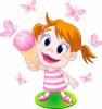 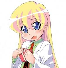    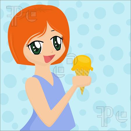   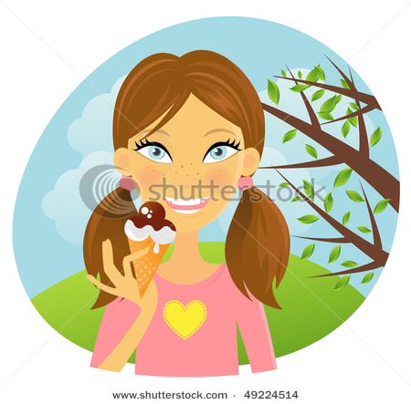 These are some pictures that I looked at for my girl character. Some of these are anime style.I think the anime style is too complicated often. I like the 1st picture of the girl with orange hair more because of the way the face is exaggerated.
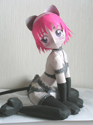
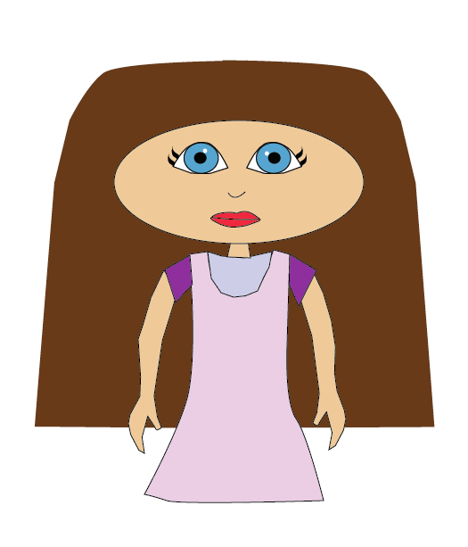   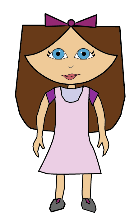 This is the character of the girl in my animation digitalized. I liked the look of girl. I found it difficult to draw the right mouth at first. I wasn't sure if I should make the lips red or not so I tried it anyway. Although the eyes looked good, they were not the right ones I thought. After doing the research into the differences of a mother and a daughter, I realised that if the mother has red lips and the daughter doesn't it looks ok. Other differences were the shape of the face, eyes and the ears. Making the mother wear earings would help. The research helped me create mother for my character.
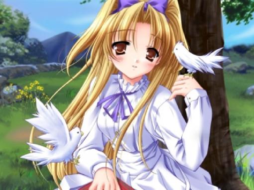
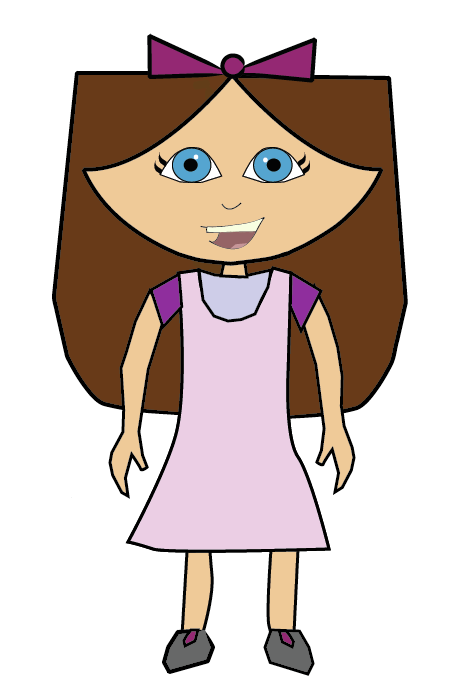
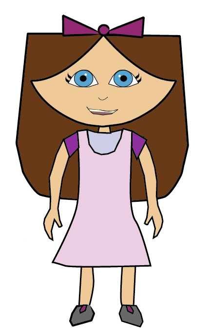
When drawing a character of a mother and her children, it is important the the characters are based on each other and it should look like they and related. The style used for the characters should be the same. I had created my character of the girl but creating her mother was difficult so I looked up on the internet images of cartoon mothers and daughters to see how they look when compared to each other. This helped me a lot. 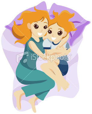 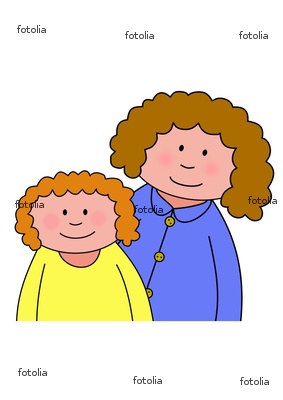  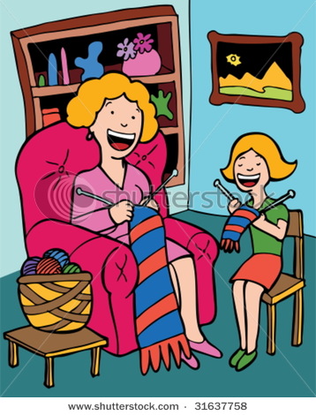 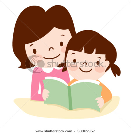 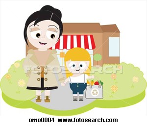 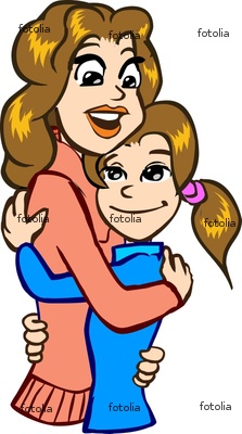 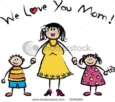 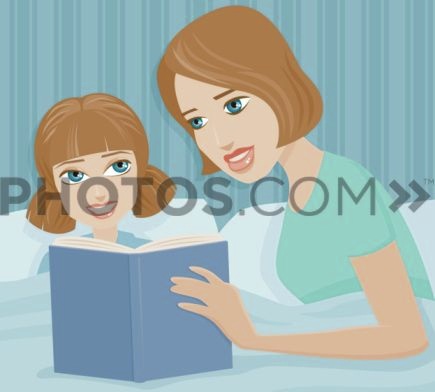 These are pictures of girls that I found on the internet. I had to examine the look of girls eyes more. The eyes I were drawing in my rough sketches were turning out wrong. I had to choose a very easy to draw style. I don't like the very first one. Whichever look I went for in the end, they had to be bgi in size. This is where the exaggeration principle would come in. 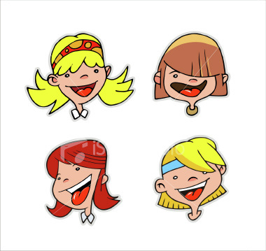  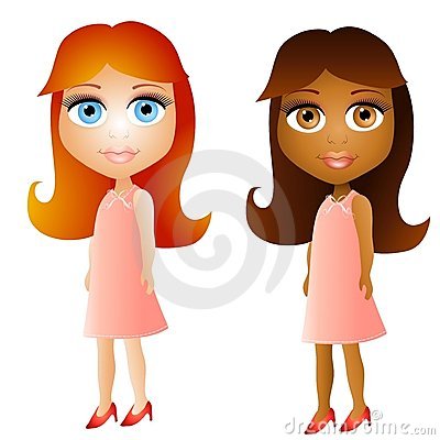 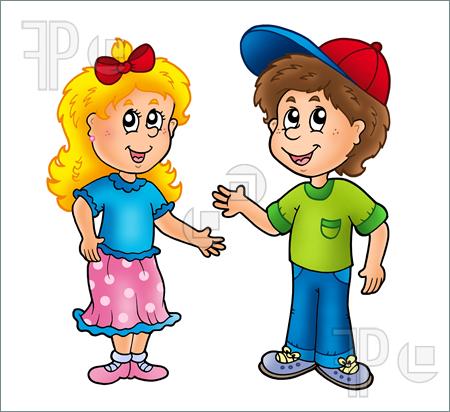 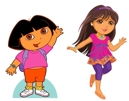 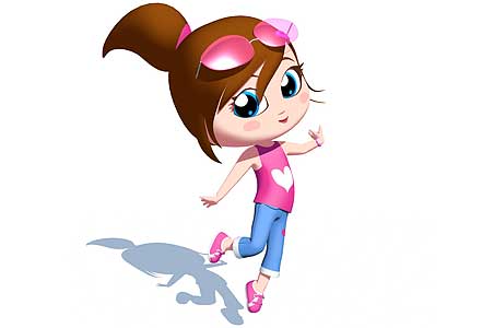 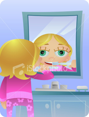 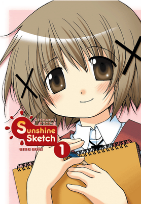 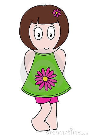 http://v.youku.com/v_show/id_XNDM4NzU4ODQ=.html
This is an animation teaching kids shapes and colours. There are better ways of teaching kids but this is a good way in which kids who have learnt the alphabet and shapes see how much they remember. To improve this animation, there should be a little longer pause before the colour or name of the shape is told. This gives kids the chance to guess think a bit more about the answers. This is a short animation which teaches kids the 5 senses. I like the way it shows the animation. I don't think this would be ideal for very young kids. This animation might be ideal for ages 7 and over. Its not the information that makes it not ideal for younger children. I think kids as young 4 years would get a bit bored of watching the animation. For younger kids, the ideal way is to put the message or information across using a story like I am doing for my animation. This is an animation I found. Its a kids series. When designing characters, animators try to stick to using simple shapes like squares, rectanngles, circles, triangles and more. I needed to show a girl with a bike in my animation and I found his as a good reference. I think its good the way the boy character has a face triangle shaped. It certainly convinces the audience that it is a face. The animation also cuts out animating difficult bits like walking at places often. Instead they show the character's top half moving and don't show the character walking. This is done by many animators. After a lot of thinking, I decided to look at how to make educational animation for kids instead of looking at anime. My target audience are kids. They can be from the age of 4 and up.
|
Fatemah KhojaI am a 3rd year animation student in university. Archives
January 2011
Categories
All
|
 RSS Feed
